Discovering Ink Traps: The inspiration
We start our design process with a quick sketch of an idea. The other takes a look and suggests a different approach. The process repeats until the initial concept forms a distinctive shape. A typeface may take months or even years to finish, and a single person can easily get lost. Working in a team feels like a second pair of eyes that gives a whole new perspective.
While searching for inspiration, I came across an old idea – ink traps. I had always considered exploring a typeface with them, but never found the right time to begin such a project.
Some of our ink trap explorations throughout the years.
If you’re unfamiliar with the term, ink traps come in various forms and shapes, but all serve one purpose: to trap excessive ink inside them. In this article, we will discuss the most recognizable ones – small triangular notches located at the joints of the letters. For a much deeper dive into the ink trap business, we recommend this article by Toshi Omagari.
These tiny, triangular indentations or notches are intentionally incorporated into the design of typefaces that need to be printed in small sizes. They are typically located at the junctures where two strokes meet at an angle, such as where the horizontal stroke of a capital “T” intersects with its vertical stem.
Ink traps ensure that ink spreads evenly and doesn’t pool or blot in these areas, which can cause the typeface to appear uneven or blurry when printed on paper. By creating a small, angled notch in these areas, ink can flow into and fill the space more evenly, resulting in clearer, more legible text.
Ink traps were first developed in the 20th century when typefaces were commonly printed using letterpress technology, which required careful attention to ink distribution. Today, ink traps are still used in many typefaces, particularly those designed for small sizes or low-resolution screens.
Bell Centennial typeface uses ink traps, which are small triangular indentations designed to improve printing in small font sizes or bad paper quality.
Breaking the Rules: Playing with Ink Traps
We found a certain charm within these peculiar forms and decided to do something different with them. They might be practical in printing, but we wanted them to be more than just functional. We wanted them to stand out and be the focal point of the typeface.
So, we asked ourselves, “Why have all those ink traps if they’re almost invisible?” We’ve had this grotesque idea of breaking their functionality and decided to enlarge them to be a noticeable part of the letterforms, dramatically changing the typeface’s look.
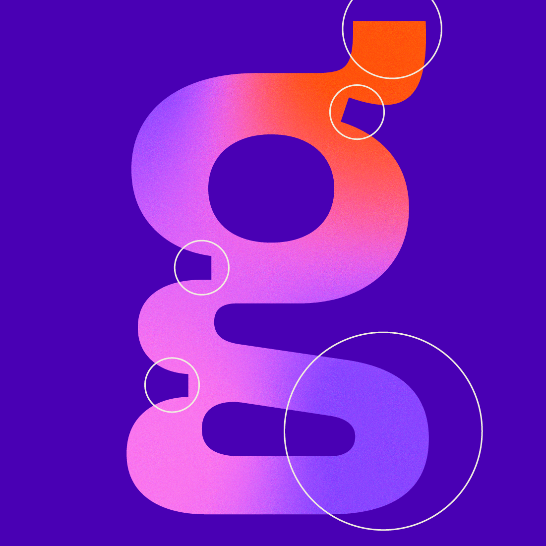
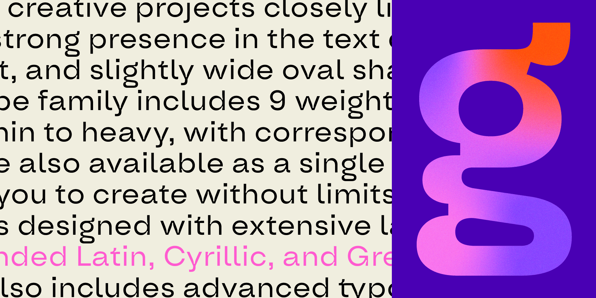
The ink traps in Oddval typeface were enlarged and made a noticeable part of the letterforms. This shift made a dramatic difference to the typeface.
To construct them, we created a small circular form as a guide for the size of the ink traps. At first, we added them timidly, but we quickly realized that they give such character to the typeface that we needed them to be everywhere.
A circular form was used as a guide to create the ink traps in Oddval. This way, they can be kept similar in size
Another question arose: Are those ink traps better off with straight or oval segments? We felt that the oval shapes made the letters much more appealing, so we experimented and incorporated them throughout the typeface.
The use of oval shapes in the ink traps of Oddval typeface adds appealing character to the letterforms.
The next step was technical but essential: The letterform became smoother and oval already, but a single node was left that served no purpose other than to restrict the shape. The question arose: Why not go all the way with the oval form and extend the ink traps to the whole letters? Next, we reviewed the entire typeface and removed nodes that made most straight elements slightly circular. This change made the typeface not only odd but also oval.
The removal of unnecessary nodes and the extension of ink traps to the whole letters made the form much smoother.
At that time, we started working with our friends from FourPlus, a creative studio that helped us with ideas about the typeface and created the most stunning presentation for the font family. Check it out on Behance.
“A typeface that is odd and oval, why not call it Oddval?” suggested the designers at FourPlus. We immediately fell in love with it. We knew the name might sound strange, but wasn’t that the point from the beginning?
From then on, we constantly asked ourselves, “Where else can we place a curve or ink trap?” The answer was simple – everywhere. These irregular forms became a crucial part of the typeface, forming the final shapes you see now.

Irregular forms and ink traps became crucial to Oddval typeface, forming its final shapes.
Oddval: A Typeface Like No Other
Oddval is a typeface that thrives in headlines and texts that benefit from a bit of character. But, interestingly, despite all these little modifications we mentioned, this display geometric sans-serif still kept some of its most essential properties – Oddval is still legible even in small paragraphs of text.

Oddval typeface is a display geometric sans-serif that is legible even in smaller paragraphs of text, making it ideal for headlines or short texts that need a bit of character.
That is how Oddval was born—a font family that blends unconventional design elements like ink traps and ovals with conventional geometric sans-serif forms. We at Type Forward went through a creative process to bring this unique typeface to life, and we hope you enjoy it as much as we do!
And, of course, Oddval is visually appealing and supports countless languages, including Extended Latin, Cyrillic, and Greek scripts. And having all the helpful staff you may need, like OpenType features, multiple weights, and a variable font, expect it to be an excellent teammate in your typographic journey.
Oddval typeface supports multiple languages, OpenType features, multiple weights, and a variable font, making it an excellent asset for any typographic journey.